Even the most iconic logos need to be refreshed from time to time. While Coca-Cola’s design has changed very little since the company began, it has made subtle changes to reflect the design aesthetics of the time. Logos don’t need to be stagnant. In fact, good logos evolve through the years as the business grows. Coca-Cola is a good example of how to get that evolution right.
As a business owner, it is important to consider refreshing your own logo periodically. Small changes to your logo design can have a significant impact on how your customers perceive your business. Looking at how the Coca-Cola logo design has evolved through the ages will provide you with some insight into how you can refresh your own logo.
In 1886, when John S. Pemberton created his now famous recipe, Frank M. Robinson, his partner and bookkeeper came up with the name Coca-Cola. He thought the Cs in the name would look good for advertising and create a memorable logo. Robinson went to work and created a logo in Spencerian script, which was in common use in handwriting penmanship at the time.
Since that time, the logo has evolved to reflect the aesthetics of the times as well as key moments in the company’s history, such as new marketing initiatives and important dates like their 125th anniversary.
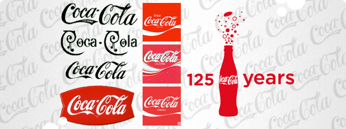
As you can see from the graphic, the essence of the Coca-Cola logo hasn’t changed much since its creation in 1886. However, you will note very subtle changes to the logo through the ages. Some of the more notable changes include:
- The insertion of the words “Trade Mark” into the tail of the first “C” in the logo from 1887 to the 1890s.
- The addition of the extra swirls onto the script for just one year from 1890 to 1891.
- The introduction of the Arciform “fishtail” logo from 1958 through the 1960s.
- The addition of the iconic white wave to the logo in 1969. The wave is what is called a dynamic ribbon device and is still used by logo designers today.
- The Keeping it real campaign in 2003 resulted to yellow being added to the white wave along with floating bubbles in the background.
- Classic was back in 2007 with a return to the simple, bold design of the single white wave.
- In 2011, Coca-Cola celebrated 125 years with a commemorative logo featuring a red background with an outline the famous bottle and celebratory bubbles bursting from it.
Drawing inspiration from the Coca-Cola logo and its many transformations through the years, you can make changes to your logo as your company grows and the aesthetic preferences of your customers change. If your logo has been stagnant for a long time, it may be time to give your web designer a call. A refreshed logo will give your business an new burst of excitement and interest for your customers.